Inverting Gear: How Our Gis are Designed
I never took any design classes while in college, I never took an art class for that matter. However, I have been fascinated with clothing for a long time. Seems like just about every memory I have of my mom, she was either knitting or sewing on her old singer machine, you know the one with the pedal action. I remember her making us clothes, cutting patterns into paper then putting clothes together for our family. I was fascinated by this; it was like Legos you could wear. Fast forward to now and I deal with clothing daily, where it is t shirt designs, embroidering hoodies, changing the inseam in shorts, or making changes to our gi sizing.
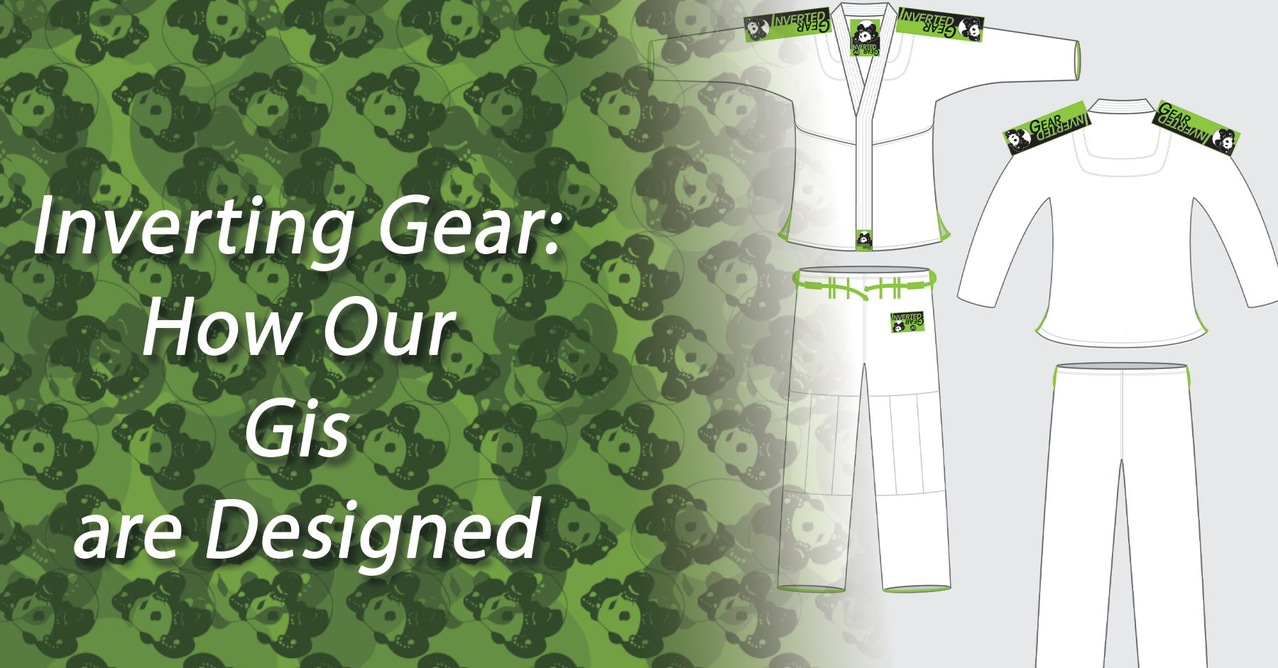
Hillary and I get to design clothing, apparel and now fitness equipment for a living. We have been doing it for 8 years. Hillary and I have worked together on just about everything we have made since she joined the team in early 2013. It all started with our first gi design. See, things were different back then. The Affliction/Tapout era was at its peak, it permeated popular culture, and it was starting to make its way to BJJ brands. We went the opposite direction and made the original panda gi. Nothing aggressive about it, no dragons or skulls, no giant lettering. While we were at it, we tried to solve some problems that had bothered me for years.

Problems we tried to solve were the following:
- Gi pants made from ripstop were too light and would cut into the back of your knees when an opponent had toreando grips and would also become really hard to grip once they were sweaty enough. So, we made ours with 12oz ripstop.
- The cord in the pants made of folded up material would eventually tangle itself and make tightening your pants an impossible task. So, we used actual rope instead.
- Finally, I was tired of losing the cord into the pants and having to rethread it so we put fat loops that would keep the rope in place during the wash. To this day I don’t know why everyone doesn’t adopt this super easy solution.
- Our Signature oversized bag came as a reaction to the frustration of the minuscule gi bags popular at the time. No one without superb origami skills would be able to get the gis back into those. So, we made a bigger bag.

Since then we have designed about 40 or so more gis. Different colors and materials. But for the most time we have kept the same principles we used in our first gi.
- Simple design, nothing convoluted or overly busy.
- No back patches to leave room for people’s academy and team patches.
- No flags: this was a trend early on, Brazilian flags, Japanese flags, American flags, European Union flags (which at first I had no idea what it was) sometimes all four. We broke this rule one time. And we are probably the only gi in history with the Greenland flag on it.
- No kanji; No random words in Kanji. No matter how cool they look or sound.
- Embroidered logo on the sleeves; This is a big one, is no mystery the logo has been part of our success. Every time we have done a design without it on the sleeves our fans have been vocal about it. They prefer our gis with the big guy on them.

This has been our design process for the gis. We plan on making more posts that detail our design and manufacturing process. Let me know what you think. Ranked rash guards are next!